The Process
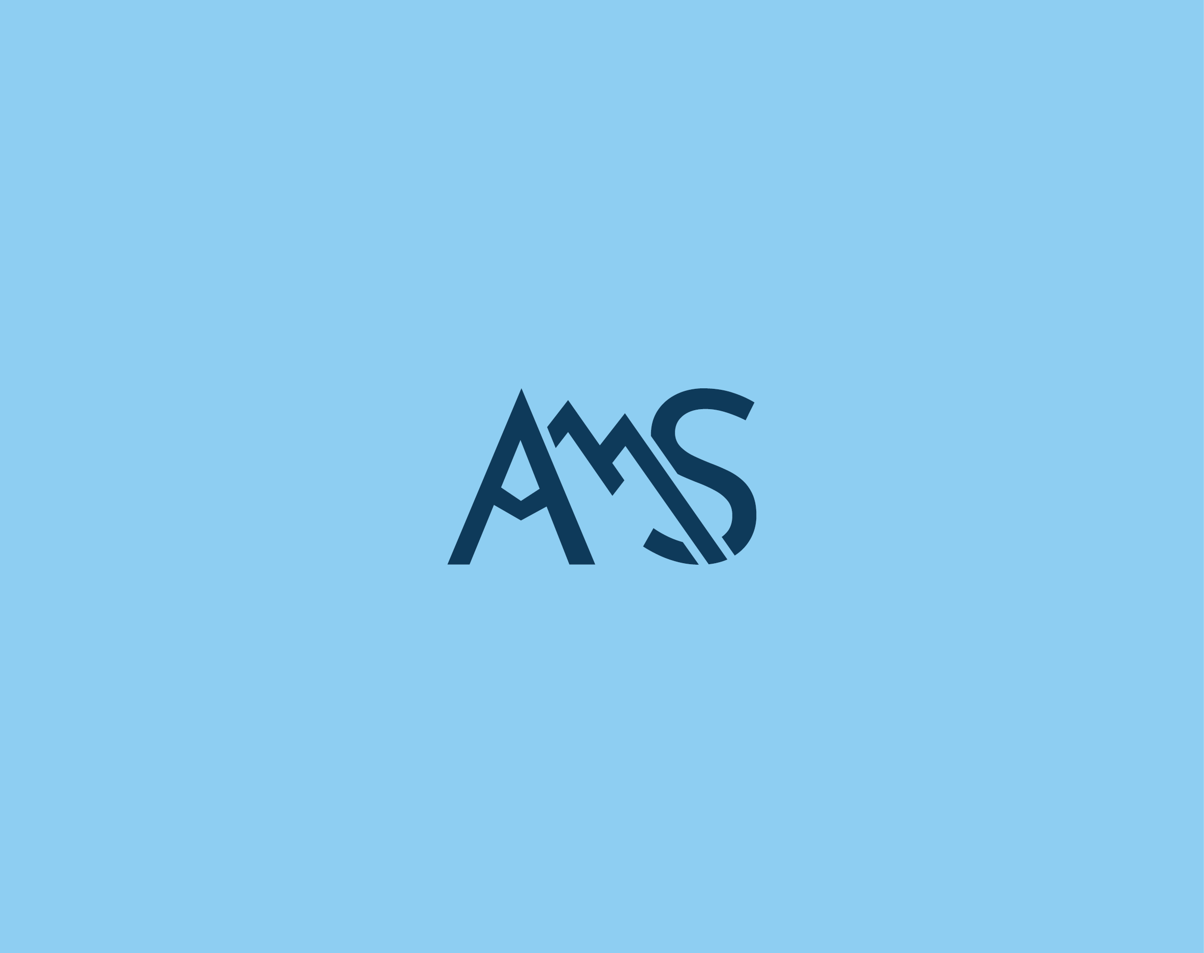
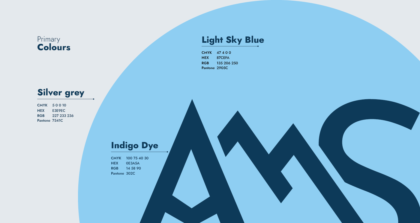
I was tasked with the rebranding of AMS Alpine Management Services. The client asked for an encased monogram with letters that would remind the viewer of the mountains using dark navy and grey silver tones.
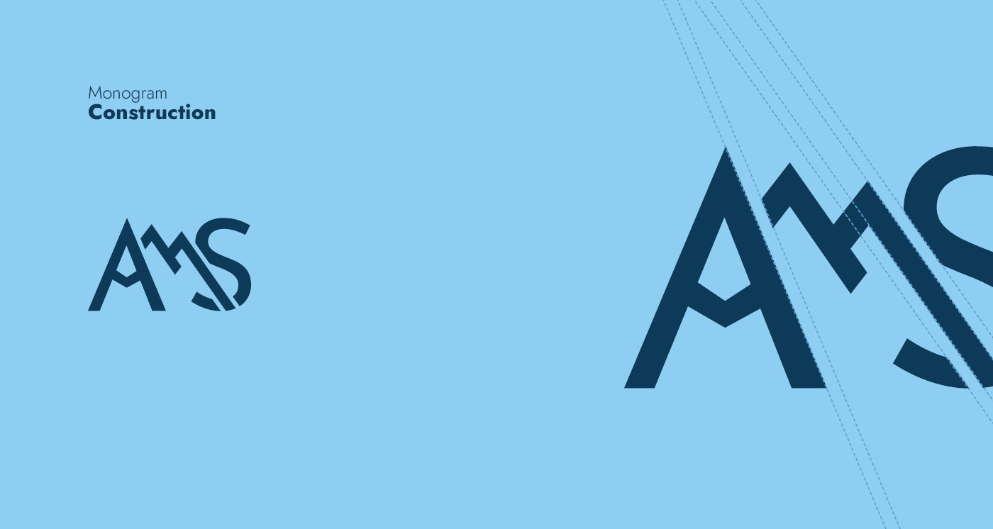
I started with simple sketches of what this might look like and subsequently went on to creating the first shapes in illustrator. Together with the client, these were then refined and set in the colour of choice. The client was offered 3 versions to start. One of which was chosen, and this logo was then refined to its final shape with harmonized spacings, angles and points.
Logo variants
Alternate versions of the logo were created to fit all needs, be it in limitations of colour or size.
Creating the Brand
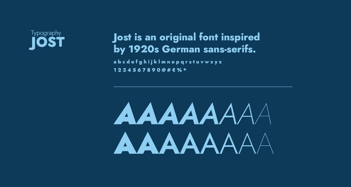
After the logo was chosen and refined to its final shape. We continued to put together the other basic aspects of the brand, colourways and fonts.
Guidelines
All the brand elements were assembled into a guideline document that can be easily consulted by the client as well as their partners so that the brand is consistently presented across all media.
Client: AMS Alpine Management Services
Date: 2020
Services: Rebranding, Logo and Brand Guidelines
Role:
Art Director, Designer, Brand Consultant
Visit Website


