Process
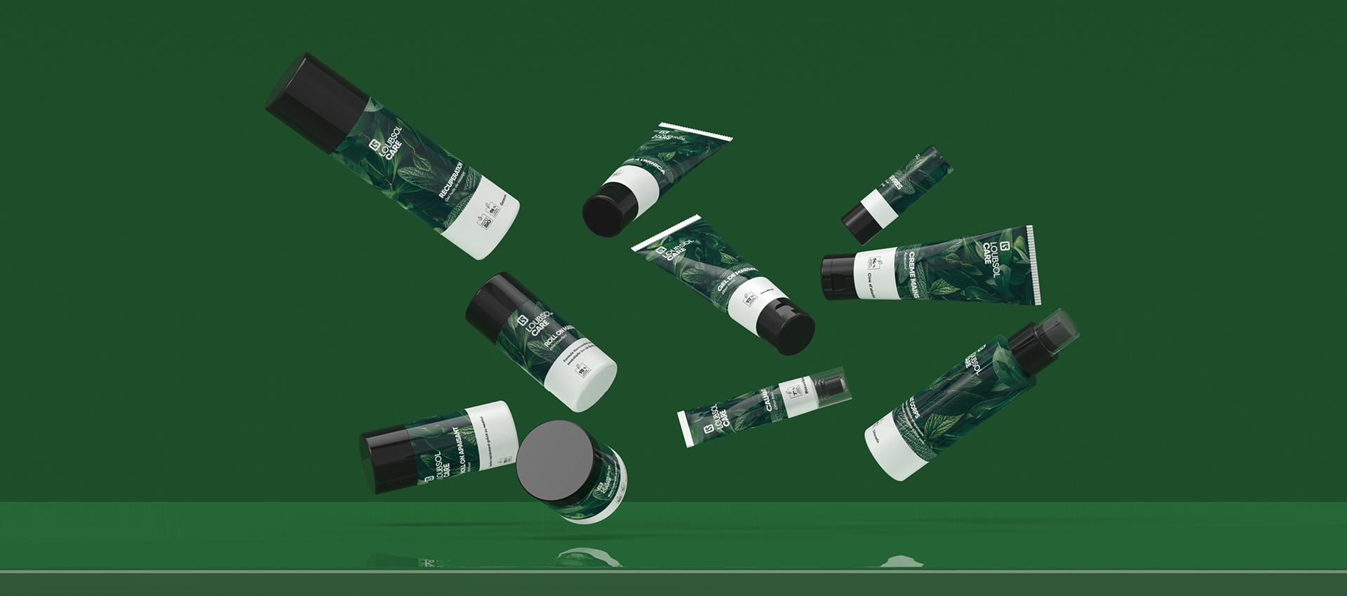
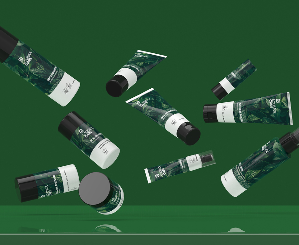
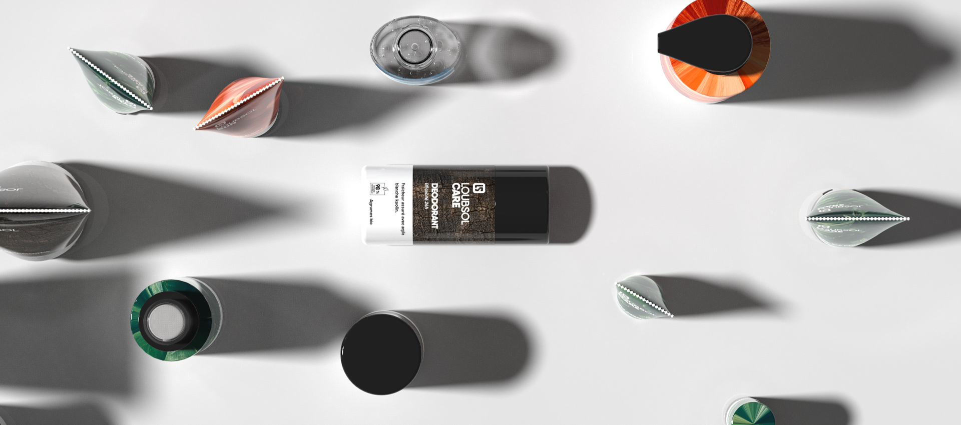
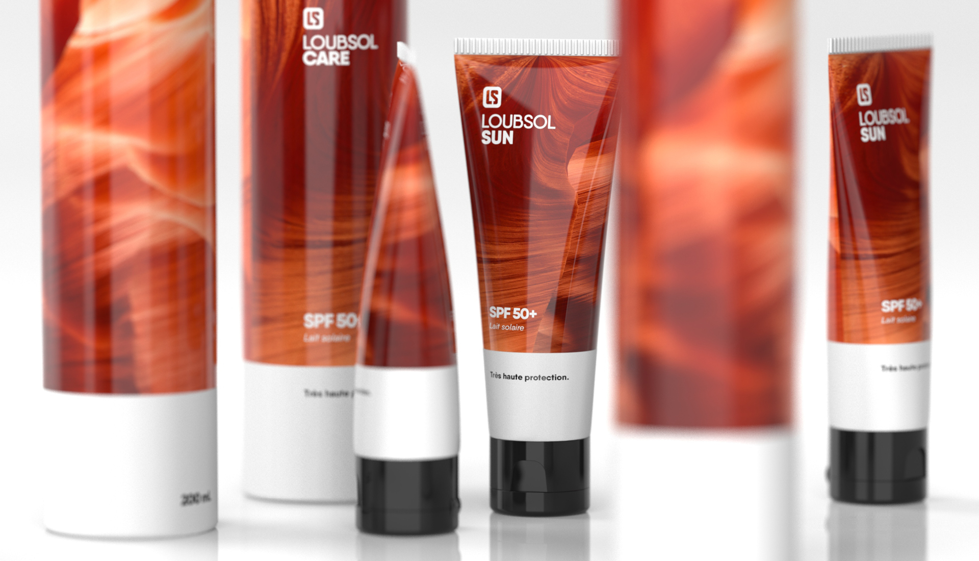
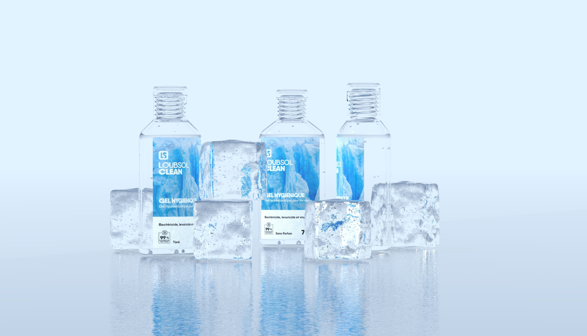
Natural textures to create a visually distinctive and interesting packaging that enforces the brand image.
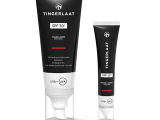
The idea behind the packaging was to use natural textures to set the tone for the use of the product and the sensation that you have when using them. Warm red, sandy tones for the sun care, icy blue for the antibacterial clean products and then green and brown plant textures based for the care and cosmetic range. In addition to the textures, icons were created to reinforce the key messaging on the tube, whilst retaining a minimalist look: percentage of natural ingredients and sun/bacterial protection. All these elements came together to create a cohesive line-up of products that appeals to customers once on the shelf. To give a realistic impression of the visual appearance, we created these designs and then applied them to 3D models, allowing us to show the client the full effect of the updated packaging before production.
